Unveiling Extranet: Enhancing the dashboard experience for desk investors
Extranet serves as a "back-end" dashboard for exchanges, desk investors, and individual investors on the platform. It allows them to manage their clients' accounts, risk, licenses, and view reports.
Additionally, they can add and manage operational points for their employees. Given the fast-paced and intricate nature of desk investors' reality, any enhancements to their speed and performance could significantly influence deal closure.

Keep it Simple: Enhancing account registration and risk management workflows
The primary objective of the platform is to register new investors and accounts. However, during discussions with our users, they expressed frustration with the slow and lengthy process, often requiring data they didn't yet have about their customers. Upon analysing the registration and risk management flow, we identified confusion and missing steps that could lead to misinterpretation.

From Chaos to Clarity: How we optimize user flow for desk investors
1. Research and collecting data - product, business and user needs
The first step we took was to thoroughly understand the product, including its usage scenarios and potential functionalities to achieve specific goals. We closely examined the actors and objectives involved, identifying what was feasible for the product, what held significance for the business, and which additional features might be impacted by or have an impact on this flow.
2. Mapping the current flow
Following this understanding, we proceeded to map out the current flow by creating a step-by-step pathway that corresponds with the existing screens. This approach enabled us to pinpoint any missing elements and assess the frequency with which users needed to navigate to complete tasks such as operator registration or license registration.

3. Identifying pain points and optimising user flow based on opportunities
During the redesign of the registration flow, we recognised that by consolidating operator and license registration, we could guide users seamlessly through steps they were already accustomed to, without the need to switch between different menu sections.

In addition to the existing process of adding operators and registering licenses, we considered introducing a third step: setting risk management. This step was identified based on user feedback indicating that it was a common task performed after registering any account.
So, we ended up with three main tasks: operator registration, product and license registration, and risk management.

For each task, we considered various scenarios and pathways to either find a solution or guide the user to the next step. This approach revealed that we were not only optimising the flow for operator or license registration but also unifying the most important tasks of the dashboard. This unified flow could be required at any moment during an investor's routine.

Designing for Efficiency: Improving Usability through UX Principles
1. Add Registration button
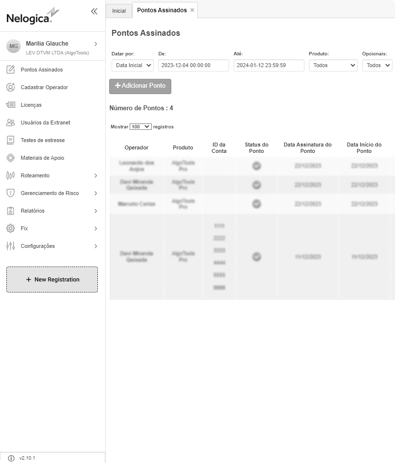
When we identified the need for changes, we decided to make adjustments to the side menu, adding a floating button that provides access to the registration flow at any time. Another enhancement was adding a step before operator registration, where users could identify the operator ID and confirm if there is any associated registration.


2. Operator Registration Screen
Following UX principles, we recognised the opportunity to adjust the number of fields. At this moment, engaging with stakeholders was crucial. We needed to confirm which data points were negotiable with other teams or institutions involved. Additionally, we suggested automatically populating data fields when the ID was identified. Moreover, we introduced a stepper to clearly communicate the steps of the registration flow.

Seamless Integration: Creating New and Optimised Workflows
In addressing the multifaceted challenges posed by a complex context, diverse user scenarios, and the imperative to enhance speed and intuitiveness, our solution for Extranet was comprehensive and effective. By meticulously crafting new and optimised workflows, we unified crucial tasks, ensuring easy accessibility and significantly improving performance and speed for Nelogica's valued clients. This strategic overhaul not only facilitated client acquisition but also substantially reduced the need for support, marking a significant step forward in delivering a seamless and satisfying user experience.

Refreshing Extranet: Elevating User Experience through UI Redesign
In addition to optimising the flow, we refined the registration screens and flow through UI enhancements. The final version was achieved by introducing new UI components, implementing visual solutions, and ensuring clarity of information. Below, you can see some of the specific UI improvements made.

Impacts: Lessons Learn and revisiting DS
We still had areas for improvement in terms of contrast and accessibility, so we decided to initiate another project to address these concerns. In this project, we will review our design system and enhance components, sizes, and colours. Additionally, we will translate these styles into variables to leverage the new features in Figma.


